
There’s a new Accessibility feature in iOS 11 that comes pretty close to what people have been asking for from Apple for a while now. The new “Smart Invert” feature inverts the foreground and background colours, but it doesn’t affect media, like images or icons. Because of this, you can now use the feature kind of like a “dark mode”. It works really well in the Apple stock apps – like Phone, Messages, Settings and the App Store. The best way to use this feature, might be on demand. For example, at night, when your eyes just can’t adjust to the brightness of your phone.
How To Enable Smart Invert

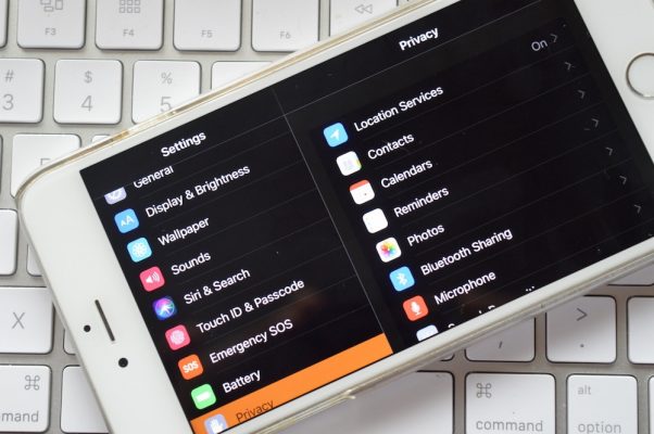
Step 1: Open the Settings app and go to General > Accessibility

Step 2: Tap on Display Accommodations

Step 3: Select Invert Colours

Step 4: From the next screen, tap on the toggle next to Smart Invert
How To Add Smart Invert to Shortcuts
Because you don’t want to have to go through that process every time, you might want to create a shortcut.

Step 1: From Settings, go to General > Accessibility

Step 2: Scroll to the bottom and select Accessibility Shortcut

Step 3: On the next screen, tap on Smart Invert Colours

Now, when you triple click the Home button, you’ll see the Smart Invert option right there.
Is this something that you would use? It is designed for people with disabilities, specifically for people with low vision. That being said, we often find that when you design something “universally” it benefits all people. Hence why it’s called universal design. For those of you who aren’t aware, universal design principles basically make it easy for everyone. While the initial design may be targeted towards people with disabilities, it ends up benefiting other people. Take a curb cut or ramp for example. They are both designed for people with mobility disabilities. But it also benefits people traveling, or parents pushing a baby stroller.

We can see the benefits of universal design in Apple’s products. Such as the “dark mode”, as it’s being called. I’m not suggesting that you have to have a disability to use or benefit from it. I think it’s great. I love to see universal design principles being applied because it benefits everyone. And, in my opinion, that’s what we should be doing when creating products, services or even designing spaces. Designing for inclusion. I, myself, have a heard time when colours are inverted. I struggle to read white text on a dark screen. But other people find that easier. That being said, some people need it.
When I think about an accessible product. Or how diversity is included during the testing phase, I definitely think of Apple. I personally know blind people who use an iPhone or a MacBook because it has all the features built into it that they need. Rather than having to buy several products to achieve their goal of just being able to use a phone or a computer. It’s great. I also think it’s great that anyone can use the accessibility features found in the Apple products. It shows Apple that people can use their products, regardless of ability and it will hopefully push them to improve the existing features and make more in the future. In the mean time, check out the Invert Colors mode.